Untangling the Concept of User Experience
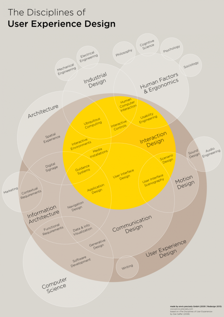
Consulting firm NN/g who are widely considered the authority on usability say that user experience ‘includes all the aspects of the interaction between the end-user with the company, its services, and its products.’ If this sounds really broad, it’s because Donald Norman who’s one of the N’s in NN/g coined the phrase “user experience” because he thought phrases like “human interface” and “usability” were too narrow, and he wanted to cover all aspects of a person’s experience. There have been attempts at diagramming exactly what disciplines are affected by user experience design, like this one from Dan Saffer’s Designing for Interaction.

When I first saw this graph, I felt overwhelmed. I wondered, “Is user-centered design supposed to involve itself in all of these areas? Also what the hell are some of these things?” Even if we just focus on the “Interaction Design” area, I don’t know a single Interaction Designer who works on both Interactive Environments and Application Design. Any one of those practices comes with a great amount of depth to gain enough understanding to optimize for good UX, and they change so frequently I genuinely believe nobody could master them all.
Now older and wiser, I believe the intent wasn’t to present a checklist of things a UX team oversees but more to list disciplines that affect a user’s experience. If anything, this outlines why UX purists bristle when UX is pigeonholed as solely being about webpages and apps.
Bad user experience
We all know what bad user experience is, because we’ve all been uncomfortable, annoyed, and inconvenienced. Bad user experience is waiting in a long line of people, or sitting in a waiting room for too long. It’s having to put up with bad smells or unwelcome noise in public places. It’s feeling tired and not having anywhere to rest, or carrying too many things and not having a place to set them down when you arrive. I truly believe part of being able to articulate good UX is getting annoyed by bad UX and wishing there were a better way of doing things (because there always is.)
The subjectivity of a good user experience
Different users have different definitions of what a good experience is. A quiet library on a rainy day is a great user experience for an avid reader, but a bad user experience for an energetic kid who just ate a bunch of sugar and had to skip recess because of the weather. This is why it’s key to be extremely specific with who an experience is for, and what the experience is trying to accomplish. User experience can also be highly contextual, because on a different day that sugar filled kid may be the avid reader longing for a quiet spot to read.
In Japan, there’s a philosophy called Omoiyari which is the concept of being empathetic and thoughtful toward others. This philosophy is at the heart of optimizing user experience, because developing a deep knowledge of what a person needs, wants, and values is the foundation of creating a good user experience.
Is UX Design really UX Design?
Today, what people are often talking about when they talk about “UX Design” is digital web, app, and service design with attention paid to the user experience. (If you really want to annoy a UX purist, describe this as “UX/UI”.) Although people in marketing, software development, sound design, and architecture are often optimizing for better user experiences (perhaps without even realizing it,) it’s unlikely you’ll hear any of them describe what they’re doing as such, much less describe themselves as “UX designers”. What people most often refer to as “UX design” would be the “Interaction Design” bubble in the chart above. I could speculate reasons this may have happened. It could be that because User Experience was so broad to begin with, it was destined to become pigeonholed. It could also be that because UX became so buzzy in the aughts, people who were interaction designers and web designers just started proclaiming they were user experience designers. Perhaps tech companies are to blame for the way they sometimes treated user experience as a checkbox for their web and app teams. Or perhaps its a mixture of all of these, and more.
This may come as a surprise since I’ve written this entire post about what OGUX is, but I can’t help but think trying to retrain the uninitiated on the true definition of user experience is a losing battle, similar to getting people to stop misusing the word “literally”. Is semantic accuracy worth the effort of retraining everyone?
Maybe that’s not the right question. The name is less important than its outcome. As long as you’re working to improve users’ experiences across all touch points, I think what you call it is less important.